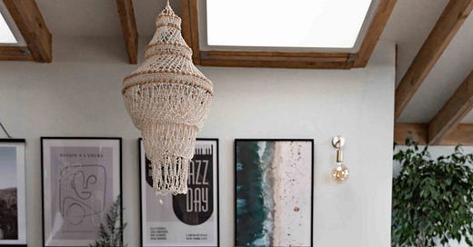
If you’ve ever renovated or redecorated, you’ll know that choosing paint colours is both the most exciting and the most nerve-wracking part of the process. Exciting because paint is where your house truly starts to feel like a home—those bare plaster walls suddenly transform into spaces with personality and purpose. Nerve-wracking because, let’s be honest, picking a paint colour can feel like one of the most overwhelming decisions ever. What if it looks different in the light? What if I hate it? What if the tester pot lied to me?!
I’ve been there. In fact, I practically set up camp there while choosing the colours when we were renovating our home few years ago. With the newly revamped layout, we had a mix of open-plan spaces and cosier rooms, all with very different light levels. I wanted to create a colour palette that felt cohesive throughout the house but still gave each space its own personality. A flow of muted colours that connected the spaces, with neutral and warmer tones as the base and a few (slightly) bolder choices thrown in for good measure.
That said, my approach wasn’t without its hiccups. Some choices were made on a whim (spoiler: some worked out better than others) and a couple of tester pots were very misleading. But in the end, we landed on colours that I absolutely love—ones that work with the light, the purpose of each room, and my love for a mix of modern and classic tones.
Before we dive into the specifics, here are a few things I’ve learned about choosing paint:
Consider the light. North-facing rooms tend to need warmer, yellower tones to balance the cooler light, while south-facing rooms can handle fresher, bluer whites. Don’t assume a colour will look the same in every room—always test it in the actual space.
Don’t fear earthy tones. When in doubt, opt for the slightly muddier or softer hue of the shades you’re debating. They’re easier to live with and tend to feel timeless.
It’s just paint. I know it feels huge, but if you don’t like it, you can always repaint. (Ask me how I know this...)
Now, let’s get to it—every paint colour I’ve used in my home, room by room:
If you would like to read the full post, get access to the full archive and follow the progress of creating my dream garden and home, consider becoming a paid subscriber. You can get 50% off from the yearly subscription here:


